Sunday, November 28, 2021

Making My Own Contrast Paint - Part 2 - Paint

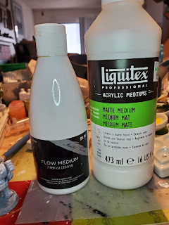
Bottles of flow improver and matte medium

Here's the rest of it! Part 1 of the process went over the trials and tribulations of creating colors from inks and went over color theory to some point. That's irrelevant if you're using existing paints that you want to turn into contrast paints. Mostly. Unless you want to change up the colors. But go read that one if you're interested in my journey.

This is where you turn color into paint. I'm using 'color' to be generic about what is being used - inks, paints, pigments, whatever. Without color you end up with clear and that's not really helpful as a contrast paint.

Here's the two artist mediums you use to make paint. Notice I specify that they're artist mediums. You can get very similar things by the craft paint for less money but you get what you pay for. Save yourself headaches (more on that later) and get the artist grade products. Craft store brand is just fine and the stores tend to have coupons. You're not going to use a lot at any given time so it's a wise investment.

  • Flow improver
  • Matte medium

Flow Improver

This is exactly what it seems to be. This will thin out your mix and extend the drying time (bonus!). It's better than water in the respect that it has .. stuff .. that works with the paint medium instead of just thinning it out. Most of the time water works fine. For this, get some flow improver.

Matte Medium

This is the important one. This makes paint. It makes the resulting blend 'sticky' so it will work as paint. Contrast paints are a heavy wash rather than a true paint so the mixing is going to be different. This is where I had my problems.

Note - don't try to get around this one by using matte varnish. Let me explain why this one caused me a lot of issues because I was stubborn.

When making washes for terrain I like to use matte varnish. It works well enough to make things sticky and it varnishes at the same time. Contrast paint seemed similar enough that I could follow the same process. This is not true. The varnish isn't sticky enough and I couldn't get the viscosity right. That's why I gave up for a while before getting matte medium. Don't make my mistake.

Making Contrast Paint

OK! Here's the good stuff! In the page there's a link to a video that got me started. It's an interesting watch by an interesting creator but I won't double link it. The end result he found was equal parts ink, flow improver, and matte medium.

Well. That sounds simple enough. My confidence was high as I measured out drops.

The results? Not so clear cut.

My problem was viscosity. I didn't have a real bottle of contrast paint to use as a guide for what my end result was supposed to be. If I could only have tried it once I would know where I was having problems. ONCE! Alas with the pandemic situation and the lack of painting groups at my local game stores I didn't have the option to play with someone else's expensive paint.

I honestly didn't know how the paint was supposed to turn out. So I kept testing and testing and testing until I gave up in frustration. Then I sulked and went back to it. I had plenty of primed figures I could use for testing but I never could get it quite right.

I think I may have had it once but didn't paint them correctly so I considered it a failure. Maybe.

I finally gave in and bought the paint. My local game store was very limited in colors so the one I got I'll probably almost never use. I messed up there and should have gone to the store with more selection so I'd have a paint that wasn't so specific. But this store isn't doing great so I gave them the money instead. I'll figure out a use for the paint. Probably. The important thing is I could finally see the viscosity I needed.

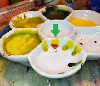
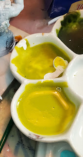
A very used daisy paint palette with a green arrow showing the purchased contrast paint viscosity and my tests

I use my palettes to see how paint will look and react on miniatures. The vertical surface shows viscosity and opacity. If you don't use welled palettes keep a scrap of flat polystyrene for the same purpose. It helps if it's the same color as your standard primer but that's up to you. My helpful painting hint for the day.

The green arrow shows the actual contrast paint. You can see where it covers then creates a pool. That's what I needed. And that's what I got, as you can see from my own results around it.

The problem is that 1:1:1 doesn't work all the time. Color viscosity, climate, and just plain luck play factors in the process. So here's how I experimented to do what needed to be done.

Stupidity note. When I mixed up the bottles of color I added matte varnish and flow improver to them, hoping I could use them right out of the bottle or with very little change. As I stated before I used the wrong thing. But the combination of them made it similar enough to the inks that it worked. After the bottles are empty I'll fill them up with the ink mixes (if I think I need that much) and deal with the new proportions at the time.

Remember when you start that you're putting in 1/3 of the amount of the final mix. That's important if you only need a little. Since I was painting a bunch of figures this is what I did.

Step 1 - Matte Medium

Matte medium is the base for this so I figured I'd start with a fixed amount. The measurements are in drops. I started with 10 drops of matte medium

Step 2 - Flow Improver

This one will be a starter amount and adjust it based on what your color medium is. Inks are the thinnest so they'll need less flow improver. Pigments are the driest so they'll probably need more. So start with less.

Step 3 - Color

Add as much color as you did matte medium. Here's your 1:1 ratio you should be able to keep constant. You'll still tweak but at least you have a baseline. Mix well.

Step 4 - Test

Put a drop of color on a vertical surface and watch how it moves. If it runs, it's too thin. If it runs down into a blob without leaving color behind it's too thin. Remember you want it to move a bit then pool on its own.

By now it should be obvious. Adjust your mix using ONE drop of the appropriate medium and test again. You're in the adjustment stage now so don't overdo it. It's much better to slowly add more than to guess how much you need then find out just how wrong you were.

Continue testing until you get that result shown above.

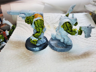
Two figures, back to back. The left one has brand name contrast paint on his back. Both of them have two colors of homemade green contrast paint on their skin.

Here's my final result. The yellow on the left figure is real brand name contrast paint. The skin is mine. You can see they're almost identical in terms of how they behave.

Using Contrast Paints

This is something I had to learn as well. These aren't used like regular paints. Trying to do that leads to disappointment and frustration. I know that.

First and foremost - don't use your good brushes for this. You don't need them and you don't want them to take the abuse they're going to get. Mild abuse but still abuse. The biggest potential problem is getting paint into the ferrule since you load the brush when working this way.

Buy yourself a set of decent synthetic round pointed brushes with decent size barrels. You do want to load the brushes but not too much. I'll get to that.

Step 1 - Fill your brush

This may take a few times to get a decent paint load onto your brush. You'll learn the balance but you want enough paint to make sure you can get the recesses filled but still be able to pull off excess with the point. So don't soak the poor things. Just load them well. This is where the potential for paint in the ferrule happens and cheap brushes take that worry away.

Step 2 - Dab it on

You're not actually painting at this point. Starting at a high point on the area do a dab/paint and watch the paint move. Then do the same thing in another similar area. This is where it gets weird as opposed to painting because gravity is involved and there's also wicking from paint already on the figure. Use the tip of the brush to pull off paint that's too thick and press to add more paint.

It's best to try this out on a couple of sample figures to get the hang of it.

Be very careful you don't overload these washes. They may look fine from the top but when you turn them over you find out where all that extra paint when and there's big glops of paint below. Those suckers are tough to remove. Even with good paint remover you'll be picking away at them. So less is more when doing this.

Step 3 - Refine

Don't overwork the paint but go over the areas and remove excess from recesses and paint over areas where it's too light. This is a final step since the paint is still very workable. After you're happy enough with it set it aside

Step 4 - Wait

The combination of mediums makes this a slow drying process. I leave mine overnight between coats. I know there's videos showing how to use contrast paints to finish figures in very short amounts of time but those are using the brand names and I don't know what their composition is. They probably do try quicker. But there's no harm in painting up one color on a couple of dozen figures and letting them sit. Then you do the next one, etc.

Also try to avoid the "I'll paint another color that doesn't butt up against the one I just did" thinking. You're going to smear the first one. No matter how careful you are you're going to end up touching the fresh paint. Accept that these are going to take a while and have other things to work on while they're drying.

Summary

As I stated earlier I wasn't a fan of using The Dip (that includes the Army Painter method) in the past. And I'm not saying I'll use this on a regular basis or as a main method of painting other models or armies. But for these models I find it a very useful way to get the style of painting I prefer with minimum effort.

A lot of orks with the light green-yellow skin undercoat

A lot of orks with the dark green skin topcoat over the yellow-green undercoat

Here's the end result of my skin experiments. I'm not sure that I need to worry too much about how the undercoat pools since the green is pretty dark and covers it up anyway. I'm still pondering putting a touch of the undercoat on the highlights of these when the time comes. It may or may not be needed and having a hoard army means there's a lot of models.

Tuesday, November 23, 2021

Making My Own Contrast Paint - Part 1 - Color


Two 3D printed orks, partially painted. The left figure has the yellow-green undercoat. The right figure has the dark green on top of the light green.

I've been kind of  hinting at working on a hobby project for far too long now. That's because I've been starting and stopping on it. Now that I think I've got it ready for prime time it's also ready for the blog.

I've split it into multiple parts because I know how wordy I get in these things. The less chatty and more 'technical' version will be a page that has necessary information. The blog posts are more the journey of how I finally got to where I was pleased with the results.

For those who don't know Contrast Paints are Games Workshop versions of a heavy wash, in their official colors that they use in all their various and sundry products. They're also expensive. For some reason I thought Vallejo had already put out their version of these but I can't find a reference so maybe I'm confused. Warcolours (a not very well known company that should be known better) created their Antithesis line which is the same thing. Army Painter is supposed to be releasing their own as well.

Obviously this has become a fast and popular way to paint. It's still just heavy washes tho.

I'm stubborn. Go figure. I'm already working as best I can not to give GW any of my money when it comes to making my ork army. I've done excellent so far. So of course I went on a search to find alternatives to buying their overpriced paints. I wasn't sure I was going to like them. I've tried painting using The Dip and haven't been happy with the results. I've always ended up stripping them and painting as usual.

In this case the more cartoon-like paint jobs I'd been seeing appealed to me. GW 40K orks are cartoon-like in general. They're the silly faction. That's what appealed to me, both in the models and in the way that they're played. So of course I wanted to give it a try.

YouTube is as it always is - a treasure trove of material for hobbies. I found a video (I'll link it in the page when it gets made) on making your own contrast paints. Actually I found quite a few videos but I like this guy's style and he goes into how he did his own testing. Plus I had the materials on hand. Kind of.

A heavy wash is made up of three things:

  1. Color
  2. Medium
  3. Thinner
If you already have paint the colors you want then you're golden. Move on to the next part which is turning those into contrast paint/heavy wash. I'm going to chat about color here.

Color can be inks, paints, pigments, whatever. For the green skins I planned on using F&W acrylic artist ink because I have all those colors due to an excellent clearance at Hobby Lobby. That and the video shows him using inks so why not? I broke out the inks and dusted off my memories of color mixing.

One of the first things was that I kind of wanted to get close to matching the GW colors. The Paint Rack phone app - wonderful thing, download it and pay to unlock all the features - showed me that I had no paints close enough in value to use as a reference. Of course. Hundreds of colors and nothing was a close enough match. Good thing I had the inks and the internet.

I found someone who posted pictures of all the contrast paints and how they look on a finished product. I won't link to that, mostly because once I downloaded the pictures I didn't save the site. It's got how the paints look over all three colors of primer - white, grey, and black. I was only concerned about white since I wanted the brightest color I could get.

I wasn't just mixing one color either. As the picture at the top shows I needed two - the undercoat and the top coat. That's two experiments in color. I took my notes and counted my drops, then compared the results. I had a lot of things like this:


FYI - All those are rejected mixes. But it showed me the differences that resulted from using different green inks and the other colors I mixed into them. I did a lot of this. Ink is cheap and none of these have the artist mediums in them to make them anything but color testing. You can seen the beginning of the streaks where I tested them when they weren't a pool of color at the bottom. The palette well is angled so they did a nice transition from thin to thick on their own.

I was testing the ratios of green to yellow and different shades of both green and yellow. You can see that the results turned out quite different. It was a great way to relearn how colors work. I do have some books on mixing acrylics into thousands of shades but didn't refer to it (much) in this process. Instead I used my intuition and what I already thought I knew.

To cut to the chase I did find colors I liked for the pair. They're not the ones in the top photo either. I just liked that pose and how it showed both layers. The real results will be in a post showing off the full paint jobs. The final recipes will be in the post.

I needed other colors as well if I was going to do all contrast paints on these. Another video showed the results of that and I didn't mind the results. So more color testing.

I made a couple of other colors than this but you can see the two different browns. Yes. Purple and blue were used in making that brown. It's why they're on the palette, so I could have a reference back to them. Brown is a funny color and I'm not going down that rabbit hole here, especially since it isn't even a real color.

I made a black paint that is mostly Payne's Grey with a touch of black. Again, color mixing and theory here. Black is not a color. It's a tint. Payne's Grey is a very nice rich dark grey that's translucent. The black was to make it just a touch darker and to make it a little more opaque. That mix worked.

I did screw up with red. This is where I would have put a picture of the result but for whatever reason I don't have one. I swear I took pictures of all of the parts of the process. The screw up is I forgot how transparent red is. It's why it's so difficult to paint good red. When I put it on the mini I got a really weak and ugly result of some red in the recesses and a slight hint of pink on the highlights. This was not what I wanted. That's when I remembered the opacity problem and when I set the whole thing aside for a while.

Yellow has the same issues as red most of the time. Since ork yellow is any shade of yellow you want I didn't bother to mix a shade. The only reason I mixed a red was because I didn't like the straight red inks for orks. I felt it was too wimpy. I have not tried the yellow ink contrast paint so I can't say whether or not it's a problem.

After my sulking break I went back and resolved the issues with the paint itself. I do have my skin colors and mixed up bottles of them (that's another story) but also had been thinking about using more contrast paints on the mini itself. I'd been wavering between that and paint with a wash/glaze layer. I settled on contrast paints.

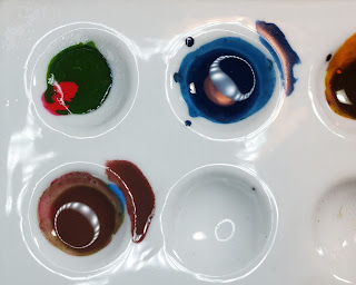
More color experiments! I took pictures of the colors then the resulting mix and how it looked when painted. These are small experiments - the palette wells are less than an inch across. 

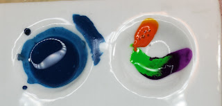
Brown 1 (which actually turned out green) and blue 1 test
The one on the left was supposed to be Brown 1, since any three colors mixed together become brown. They did not in this case.
Blue 1 is planned on being a slate blue, probably.

Blue 1 result, too bright. Brown 2 colors - purple, orange, and green

So. Blue 1 didn't turn out to be slate. This happens. It's a lovely shade.
The right is Brown 2, once again trying the concept of 3 colors equals brown.

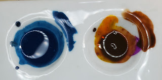
Blue 1 hasn't changed. Brown 2 is a nice neutral brown
Ok. Brown 2 isn't bad. It's a nice neutral-ish brown. I can deal with that.

Brown 3 is all primary colors - red, yellow, blue
Let's go wild with Brown 3! Primary colors baby!
Brown 3 = green. Again. Showing the drop(s) of red for continued testing
Brown 3 is once again green. I'll talk about that below. I added another drop or so of red to see if I could shift it.

Brown 3 + more red = greenish brown
Brown 3 finally shifted into a brown. Kind of a brown. A very greenish brown.

Brown 3 final result is a decent enough brown shaded to red now.
Brown 3 gets more red! I wasn't going to let this color mix get the best of me. The excess of red made a reddish brown after moving out of the green range.

Three colors so far - Brown 1, Blue 1, Brown 3. Brown 1 shows more red ink to be mixed
Going back to Brown 1 after seeing what red did for Brown 3.
Brown 1, Blue 1, and Brown 3. Brown 1 is still greenish
OK. Let's not get into what shade we could name Brown 1.

Blue 2 showing the light and dark inks
Blue 2 is trying for the slate color again. Or maybe denim. That's Payne's Grey in the middle.

Blue 2 showing just how much Payne's Grey will darken a shade. More light blue added.
Too dark. More light blue into Blue 2.

Blue 2 done. Kind of sort of but not really the slate or denim shade I wanted
Blue 2 as done as it's going to get.

This is where I stopped experimenting with color for other areas of the minis and decided that I would use my existing paints. I have all these colors so there's no reason to try to reproduce them except for the fun that was the experimenting. Don't get me wrong. Experimenting is fun and I'm glad I did it.

If you've got the materials and interest in what makes up colors then by all means have at. I could do this because I have all the ink colors. If I had to buy more of them I would have seriously considered just buying the paints given how expensive bottles of ink are, how little is used, and the unknown of what colors I needed. In the short term the actual paints would have made more sense. Probably the Warcolours paints but you never know.

Rather than show you painted minis here's the final colors I settled on for the ork skin. Ignore the white in the middle well - that's primer I used for touching something up. But the streaks up the side of the palette well in the middle are important later.

Final ork skin tones shown in palette wells - the dark green top coat, the undercoat with some primer on top so I couldn't use that well again, the undercoat


Friday, November 12, 2021

HASO - Star Trek Crossover - Humans Being Humans

Normally I'd skip these because they are a different genre of fanfic but there's some out there I do like. Today I bring you one from Tumblr (big surprise) and roachpatrol.

Klingons: Okay we don't get it.

Vulcan Science Academy: Get what?

Klingons: You Vulcans are a bunch of stuffy prisses but you're also tougher, stronger, and smarter than humans in every way.

Klingons: Why do you let them run your Federation??

Vulcan Science Academy: Look.

Vulcan Science Academy: This is a species where if you give them two warp cores they don't do experiments on one and save the other one for if the first one blows up.

Vulcan Science Academy: This is a species where if you give them two warp cores, they will ask for a third one, immediately plug all three into each other, punch a hole into an alternate universe where humans subscribe to an even more destructive ideological system, fight everyone in it because they are offended by that, steal their warp cores, plug those together, punch their way back here, then try to turn a nearby sun into a torus because that was what their initial scientific experiment was for and they didn't want to waste a trip.

Vulcan Science Academy: They did that last week. We have the writeup right here. It's getting published in approximately six hundred scientific journals across two hundred different disciplines because of how many established theories their ridiculous little expedition has just called into question. Also. They did turn that sun into a torus and no one actually knows how.

Vulcan Science Academy: This is why we let them do whatever the hell they want.

Klingons: .. Can we be a part of your Federation?


Wednesday, November 10, 2021

HASO - Exploration

Tumblr! I do so enjoy the variety that people sift out of there. Today's contribution is by the-grand-author. Tidied, etc. I did approximate the temperatures because I didn't feel like doing research to find out if the ones used were in F or C. So I did my best.

Alien: And you say the poles of your world would get as low as -100C with wind chill?

Human: Yup, with blizzards you can't see through every other day just about.

Alien: Amazing! When did you manage to send drones that could survive such temperatures?

Human: .. Well actually ..

Alien: What?

Human: .. We .. kinda .. sent .. people.

Alien: ...

Human ...

Alien: What?

Human: We sent-

Alien: No. I heard you. I just- What? You sent .. HUMANS? to a place one hundred degrees below the freezing point of water?

Human: Y-yeah...

Alien: And they didn't .. die?

Human: Well the first few did.

Alien: PEOPLE DIED OF THE COLD AND YOUR SOLUTION WAS TO SEND MORE PEOPLE???


Monday, November 8, 2021

HASO - Volcanic Islands

Good old Tumblr. This time from val-tashoth. Touched up, etc.

Alien: You're telling me you have .. settlements. On islands with active volcanism?

Human: Well, yeah. I'm not about to tell Iceland or Hawaii how to live their lives. Actually it's kind of a tourist attraction.

Alien: What? The molten rock?

Human: Well, yeah! It's not every day you see a mountain spew out liquid rocks! The best one is Yellowstone, though. All these hot springs and geysers from the supervolcano-

Alien: You ACTIVELY SEEK OUT ACTIVE SUPERVOLCANOES?

Human: Shit, man. We swim in the groundwater near them.

Friday, November 5, 2021

HASO - Habitable Planets

A gem from Tumblr user crazypages. This is under the concept that Earth is Space Australia, for reference. As always I tidied it up a bit in the retyping but didn't change the spirit.

Alien: I'm sorry, what did you say your comfortable temperature range is?

Human: Honestly we can tolerate anywhere from -40 to 50 Celsius, but we prefer the 0 to 30 range.

Alien: .. I'm sorry. Did you just list ranges below the freezing point of water?

Human: Yeah, but most of us prefer to throw on scarves or jackets at those temperatures. It can be a bit nippy.

Other human: Nah mate. I knew this guy in college who refused to wear anything past his knees and elbows until it was -20 at least.

Human: Yeah. Everybody knows someone like that.

Alien: ... And did you also say 50 Celsius? As in, halfway to the point of water boiling?

Human: Eugh. Yes. It sucks, we sweat everywhere, and god help you if you touch a seatbelt buckle, but yes.

Alien: ..... We've got like 50 uninhabitable planets we think you might enjoy.

Wednesday, November 3, 2021

HASO - Bird War

This one is an image from Reddit r/humansarespaceorcs but without attribution since whoever made the image posted on Facebook didn't bother to include that part.

Jerry: Yeah? What is it?

Zilbur: I've been looking through your planet's history log and I need clarification on something.

Jerry: What is it?

Zilbur: I've found something called "The War of the Emus". What was that about?

Jerry: Uhhh....

Zilbur: Human?

Jerry: Well it was .. when we .. kind of .. went to war against .. emus.

Zilbur: What is this "emu" you speak of?

Jerry: It's a type of .. bird.

Zilbur: A what?

Jerry: A bird is a type o- 

Zilbur: I KNOW WHAT A BIRD IS. What I meant was that did you just say that you went to war against birds?

Jerry: Yes.

Zilbur: *inhales* WHY!?

Jerry: If it makes it any better they were pests that ate our crops.

Zilbur: No. It doesn't. You wanna know why?

Jerry: Why-

Zilbur: THE HISTORY LOG SAYS THE EMUS WON!

Jerry: Right. I forgot about that.

Zilbur: IDIOTS! ALL OF YOU!


Monday, November 1, 2021

HASO - Not Noticing Pain

From @nonbinarygaymergirl on Tumblr. This seems to be part of a cooperative writing effort between a lot of authors using the same characters. There's no specific order to them since they're bits of story.

The humans were at third meal when Zork'ak sat on the bench. The nutrient researchers had been experimenting with the human flavors, attempting to add it to the meals. This bowl had a slight ‘savory’ undertone that Zork'ak very much enjoyed.

Wren moved over to allow Zork'ak to sit next to her, which caused a weird constriction around xer straque, xer fluid-pumping organ. Wren smiled at xem, and it happened again. Xe might need to go to the medical wing after meal.

"I don’t feel sorry,“ Adam was saying.

"You sprained my wrist!” Steve was clutching his extremity to his chest.

"You should’ve landed the right way.“

"Oh, shut up,” Carrie grumbled.

As Carrie lifted her utensil to her mouth, Zork'ak caught a glimpse of a long cut running the length of the lower half of her extremity. “How did you hurt yourself, Carrie?”

She looked surprised. “Where?” Zork'ak carefully traced the line with xer talon. Carrie twisted to look at the scabbed cut. “Hmm. Wonder when that happened.”

"The piercing of your skin sends pulses through your nerves, correct?“

"Well, yeah.”

"So you should feel it.“

"Well, I mean. You usually do. I guess I just didn’t notice when it happened this time.”

"Sometimes our body can be more focused on other things or like the pain is so minor we barely notice or remember it,“ Adam said. “I mean we obviously notice big things.”

"I probably cut on something while we were at the collection field.“ Carrie continued eating.

"She also is the kind of person who doesn’t notice a lot.” Adam closed his eye in what Zork'ak had been told is called a ‘wink.’ “I, on the other hand, do notice things like this.” He flipped his extremity over to reveal two blue spots on his arms. Zork'ak did not study human bodily science, just behavior so xe did not know what this medical condition was.

"What disease do you have?“ Zork'ak leaned forward to look at Adams, running a talon over the skin to see if it felt different. Xe had been told that xe could touch the humans without asking permission in these situations.

"Oh, it’s not a disease. It’s called a bruise. It means my blood vessel, the tube that brings the blood to all my organs, was ruptured. It’ll go away after a few days.”

"You rupture delivery vessels that are necessary to keep your organs functioning and it does not affect your body?“

Adam shrugged. "We have multiple blood vessels.”

"Is this an extremely painful occurrence?“ Zork'ak had noticed humans did not seem to mind pain.

"Nah. I mean, you can usually tell if you are going to bruise because it hurts a little when that spot gets hit, but very minor.”

"So you don’t notice when you are cut but when one of your… blood vessels,“ Adam nodded,” blood vessels ruptures but you do notice when you touch an object too hard.“

"Uh, kind of? It just really depends.”

Zork'ak did not understand how some humans would notice these nerve impulses but others did not. Xe turned to look at Wren, who had been listening to the conversation, and noticed a dark purple spot on Wren’s upper extremity.

"What is this?“ Xe pointed at the spot on Wren’s arm.

"Uh,” Wren tried to twist her extremity. “Where?” She was stretching it out, twisting around, finally able to look at the spot on the back side. “Oh, bruise.” She poked it. “Ouch. That hurt.” She proceeded to press it again. And again.

"Wren?“ She touched the spot again and wrinkled her nose. "Why do you continue to press the spot that hurts?”

She looked at xem. “You know, I don’t have an explanation really. I guess it doesn’t hurt that much so it’s enticing to keep pressing it to see if it hurts more each time. I’m not sure.”

"How did you get that bruise?“

"Couldn’t tell you.”

Zork'ak looked back at Adam. “I thought you said you all noticed when you have ruptured your blood vessels, and that one looks more painful.”

"Hers is a dark color because it’s healing, not because it’s more painful. Bruises are nearly the same pain level. Some hurt when you press them,“ he cut his eyes at Wren, "but having them doesn’t hurt really.”

"She does not know how she received hers.“

He looked at her arm, then his. "Like I said, it depends.”

"But.“ Zork'ak was looking at their bruises. "How do you-you don’t notice-I do not understand.” Klyls always noticed any abnormality in their body’s functioning. There was not a time that Zork'ak had not noticed something causing xem pain.

"It’s complicated, I guess. Our species doesn’t have set rules really.“

"I have noticed.” Xe looked at Wren. “It makes your species quite hard to study.”

She laughed. “Good. You can’t know all of our secrets.” She winked at xem then.

Zork'ak found it hard to breathe for a fraction of a cycle. Xe definitely needed to go to the medical wing.