I've been kind of hinting at working on a hobby project for far too long now. That's because I've been starting and stopping on it. Now that I think I've got it ready for prime time it's also ready for the blog.
I've split it into multiple parts because I know how wordy I get in these things. The less chatty and more 'technical' version will be a page that has necessary information. The blog posts are more the journey of how I finally got to where I was pleased with the results.
For those who don't know Contrast Paints are Games Workshop versions of a heavy wash, in their official colors that they use in all their various and sundry products. They're also expensive. For some reason I thought Vallejo had already put out their version of these but I can't find a reference so maybe I'm confused. Warcolours (a not very well known company that should be known better) created their Antithesis line which is the same thing. Army Painter is supposed to be releasing their own as well.
Obviously this has become a fast and popular way to paint. It's still just heavy washes tho.
I'm stubborn. Go figure. I'm already working as best I can not to give GW any of my money when it comes to making my ork army. I've done excellent so far. So of course I went on a search to find alternatives to buying their overpriced paints. I wasn't sure I was going to like them. I've tried painting using The Dip and haven't been happy with the results. I've always ended up stripping them and painting as usual.
In this case the more cartoon-like paint jobs I'd been seeing appealed to me. GW 40K orks are cartoon-like in general. They're the silly faction. That's what appealed to me, both in the models and in the way that they're played. So of course I wanted to give it a try.
YouTube is as it always is - a treasure trove of material for hobbies. I found a video (I'll link it in the page when it gets made) on making your own contrast paints. Actually I found quite a few videos but I like this guy's style and he goes into how he did his own testing. Plus I had the materials on hand. Kind of.
A heavy wash is made up of three things:
- Color
- Medium
- Thinner
Color can be inks, paints, pigments, whatever. For the green skins I planned on using F&W acrylic artist ink because I have all those colors due to an excellent clearance at Hobby Lobby. That and the video shows him using inks so why not? I broke out the inks and dusted off my memories of color mixing.
One of the first things was that I kind of wanted to get close to matching the GW colors. The Paint Rack phone app - wonderful thing, download it and pay to unlock all the features - showed me that I had no paints close enough in value to use as a reference. Of course. Hundreds of colors and nothing was a close enough match. Good thing I had the inks and the internet.
I found someone who posted pictures of all the contrast paints and how they look on a finished product. I won't link to that, mostly because once I downloaded the pictures I didn't save the site. It's got how the paints look over all three colors of primer - white, grey, and black. I was only concerned about white since I wanted the brightest color I could get.
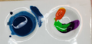
I wasn't just mixing one color either. As the picture at the top shows I needed two - the undercoat and the top coat. That's two experiments in color. I took my notes and counted my drops, then compared the results. I had a lot of things like this:
FYI - All those are rejected mixes. But it showed me the differences that resulted from using different green inks and the other colors I mixed into them. I did a lot of this. Ink is cheap and none of these have the artist mediums in them to make them anything but color testing. You can seen the beginning of the streaks where I tested them when they weren't a pool of color at the bottom. The palette well is angled so they did a nice transition from thin to thick on their own.
I was testing the ratios of green to yellow and different shades of both green and yellow. You can see that the results turned out quite different. It was a great way to relearn how colors work. I do have some books on mixing acrylics into thousands of shades but didn't refer to it (much) in this process. Instead I used my intuition and what I already thought I knew.
To cut to the chase I did find colors I liked for the pair. They're not the ones in the top photo either. I just liked that pose and how it showed both layers. The real results will be in a post showing off the full paint jobs. The final recipes will be in the post.
I needed other colors as well if I was going to do all contrast paints on these. Another video showed the results of that and I didn't mind the results. So more color testing.
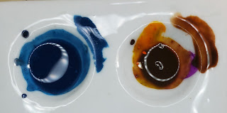
I made a couple of other colors than this but you can see the two different browns. Yes. Purple and blue were used in making that brown. It's why they're on the palette, so I could have a reference back to them. Brown is a funny color and I'm not going down that rabbit hole here, especially since it isn't even a real color.
I made a black paint that is mostly Payne's Grey with a touch of black. Again, color mixing and theory here. Black is not a color. It's a tint. Payne's Grey is a very nice rich dark grey that's translucent. The black was to make it just a touch darker and to make it a little more opaque. That mix worked.
I did screw up with red. This is where I would have put a picture of the result but for whatever reason I don't have one. I swear I took pictures of all of the parts of the process. The screw up is I forgot how transparent red is. It's why it's so difficult to paint good red. When I put it on the mini I got a really weak and ugly result of some red in the recesses and a slight hint of pink on the highlights. This was not what I wanted. That's when I remembered the opacity problem and when I set the whole thing aside for a while.
Yellow has the same issues as red most of the time. Since ork yellow is any shade of yellow you want I didn't bother to mix a shade. The only reason I mixed a red was because I didn't like the straight red inks for orks. I felt it was too wimpy. I have not tried the yellow ink contrast paint so I can't say whether or not it's a problem.
After my sulking break I went back and resolved the issues with the paint itself. I do have my skin colors and mixed up bottles of them (that's another story) but also had been thinking about using more contrast paints on the mini itself. I'd been wavering between that and paint with a wash/glaze layer. I settled on contrast paints.
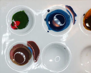
More color experiments! I took pictures of the colors then the resulting mix and how it looked when painted. These are small experiments - the palette wells are less than an inch across.
This is where I stopped experimenting with color for other areas of the minis and decided that I would use my existing paints. I have all these colors so there's no reason to try to reproduce them except for the fun that was the experimenting. Don't get me wrong. Experimenting is fun and I'm glad I did it.
If you've got the materials and interest in what makes up colors then by all means have at. I could do this because I have all the ink colors. If I had to buy more of them I would have seriously considered just buying the paints given how expensive bottles of ink are, how little is used, and the unknown of what colors I needed. In the short term the actual paints would have made more sense. Probably the Warcolours paints but you never know.
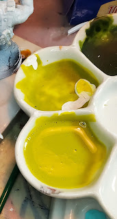
Rather than show you painted minis here's the final colors I settled on for the ork skin. Ignore the white in the middle well - that's primer I used for touching something up. But the streaks up the side of the palette well in the middle are important later.


No comments:
Post a Comment