Showing posts with label work in progress. Show all posts

Wednesday, July 20, 2022

For Your Own Peace of Mind - Organize!


As my previous post said I'm packing to move. The deadline is fast approaching and of course I'm scrambling now since before this I had 'plenty of time'. I no longer have 'plenty of time'.

I'm going to use this post as a heartfelt plea for you to go through your hobby/office spaces. Please declutter and throw out/donate/sell what you're not going to use. Look, actually look, at what you have and be brutally practical. Take what's left and put it into storage containers, then put those on shelves. It's a lot of work and it may not seem necessary if you're in your forever home or don't plan on moving.

But sometimes you don't get the luxury of planning on moving. Sometimes your forever home turns out not to be your forever home. And in general we collect and pile up a lot of crap.

I was somewhat lucky in that I started organizing things into plastic storage bins a while ago but never really finished. I'm paying for that now in some respects and in others not so much. I can use a lot of the 'unorganized' things and use them to fill space where the containers don't fit the boxes. That helps greatly in the short term, it isn't so great in the long term.

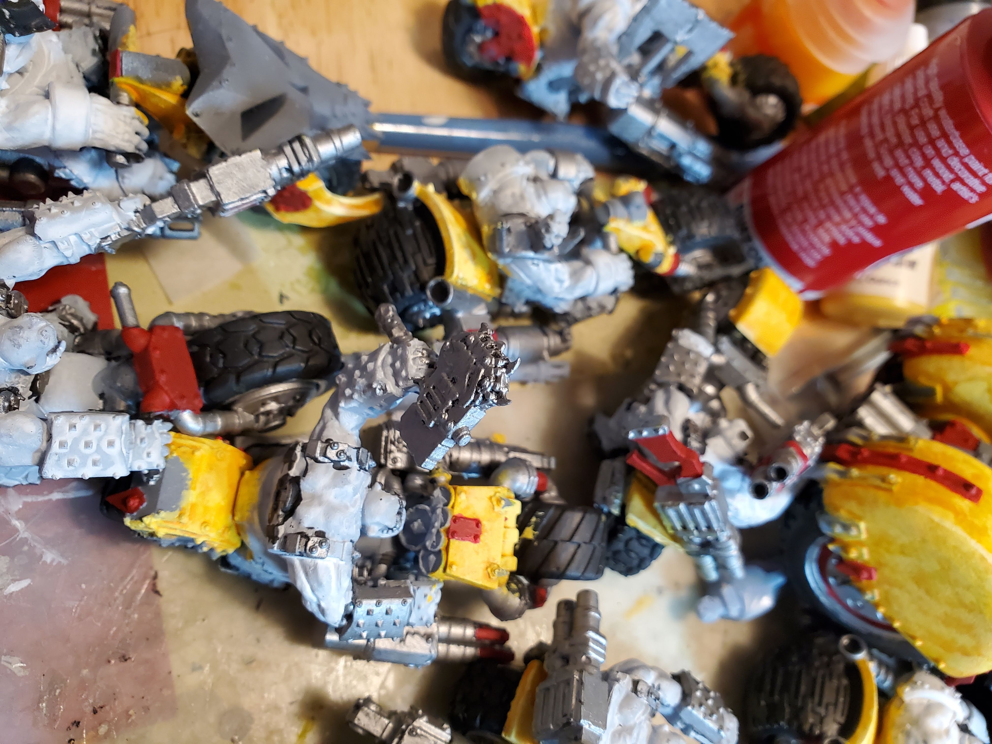
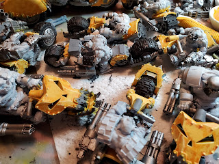
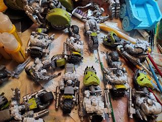
I'm not saying you can't keep things 'just in case'. I've got a lot of things like that for scratch building and they pack up just fine. When they're unpacked they're going into, you guessed it, plastic storage bins. I've also found a lot of things that I kept because it was more convenient than throwing them out. That's no longer the case. I don't need them and see no use for them in the near to moderate future. So they go.

When you're in one place for a long time this happens. It's easier to leave things out because you're using them than it is to go through and put them away. Piles occur. There's no judgement here. There can't be based on my own situation. But I'm saying that organization will save you a lot in the long run.

I'm a big fan of plastic bins over cardboard when possible. Get ones with tops. I use a lot of the dollar store ($1.25 store?) plastic shoeboxes and their smaller containers with handy flap lids. Those two sizes are mostly what I use since I can't make them too heavy for metal miniatures and the supplies fit mostly very well into the smaller ones. I'm also a huge fan of the 16 x 16 scrapbook paper holders from the craft store since they hold mini paint bottles well. I have a cart that holds six of those. I'm going to need another cart. But when I put the paint away it's put away.

In general it's a lot easier to find stuff if you've put like with like. All the sandpaper? In a plastic paper holder with a sliding lock. All the Dremel accessories? In a container. All the bases? In a container. It's work up front but if you look at it, really look at it, it's a one time pain. Then it saves you time when you're looking for where you put whatever later.

I also have storage cubes with doors. I lucked out getting those because they were discontinued. They fit perfectly into my current space and should fit well into my new space with some planning. Right now they're handy to where I paint so I can keep things I use a lot in there. In plastic storage bins or loose-ish in other kinds of containers. I use a pill bottle and a pilsner glass for the second rate and terrain paint brushes. They're contained.

I'd have a lot more trouble if I hadn't done this up front. Even with doing a partial organization it's saved me a lot of time and things are already together. When a box has 'bases' written on it I know all the bases are in there when it comes time to unpack. When a box has 'air' written on it I know it's everything I need for the air compressor. There will be other things in those boxes but I know what the important things are.

Another thing I found from all this is just how much I have of particular kinds of items. Between you and me I have too many of some. I know I can clear one of those when I get settled. The other will take more work and planning. But until it was all gathered up I didn't know the extent of what I had. Having it scattered put it out of mind. Having it put in one place lost me that luxury.

So just how well organized will the new space be? I'd like to think it's going to be decently organized. What's not in plastic containers will get there. The things that can be reduced will be. I will have more storage space so more things will be visible for me to use. I'll even label the containers if I get all kinds of ambitious. Those are all future considerations. Right now it's a matter of a rough organization of at least getting things into the boxes that will go into the same room.

I'm lucky in that I'll have more rooms for things now. With my hobbies I outgrew my two bedroom apartment resulting in a dense accumulation that was difficult to use. I worked hard to use every possible bit of storage space and I think I did well. The problem with that was getting to most things. I also had things on the shelves that I wasn't going to use but had the space to put them. That happens. That's going to happen again. By having more rooms and separating two big space hogging hobbies I'll have actual room to work. That's a luxury I haven't had for well over a decade.

I'll end this as I started, begging you to take the time to organize what you have. Plastic works better than cardboard in my opinion because if something bad happens that involves water your stuff has a much better chance of coming through undamaged or at least minimally damaged. Wipe it off and put it back. Cardboard, not so much. There's enough variety of sizes and shapes of plastic containers that you can find what you need or at least what will work well enough. You don't have to do it all at once. But please, please, please do it.

Tuesday, March 22, 2022

Ork Speed Freeks - Work In Progress 5

This time it's red. Lovely, lovely, pain-in-the-butt red. I won't go into the long winded details of the painting techniques because I did that in Part 4 of this series. You're welcome.

I'm still using craft paints, as the picture below shows. Here's the set of colors this time around.

Paints used for the red areas: Anita All Purpose Acrylic - 11039 Wine - Pantone 7623, Anita All Purpose Acrylic - 11003 True Red - Pantone 186, Anita All Purpose Acrylic - 308062 Light Coral - Pantone  489 (closest, Pantone is darker)
The specific paints are:
  • Anita All Purpose Acrylic - 11039 Wine - Pantone 7623
  • Anita All Purpose Acrylic - 11003 True Red - Pantone 186
  • Anita All Purpose Acrylic - 308062 Light Coral - Pantone  489 (closest, Pantone is darker)

This time there's no white or ivory. Red is one of those annoyingly difficult colors because it's wonderful right up until you get to highlighting. Highlighting means using some other color than red because red plus white equals PINK. While pink is not a terrible color in and of itself it doesn't work well for most things I paint red.

If you look up tutorials you find a lot of different ways to go with red highlights. Because of all the dark yellow on mine I decided to lean into the orange range without actually going orange. I picked that coral color because it's still in the red family while leaning into orange. Coral is one of those colors I dislike for no reason I know. It seems to work for this so now I'm stuck with having coral paint around.

To same some time here's the red and red-coral mixes dried on the parchment paper for your review.

Red and red-coral mixes

You can see that there's three shades on here. Let me explain them.

Center right - True Red. I like this color. It's a vibrant red with not so great coverage. At least two coats are needed to get this one decent. More on that later.

Lower center - True Red and Coral in about a 3:1 ratio. I'm not exactly sure since I mixed and added until I liked it. This was the color stippled over the base coat.

Upper left - True Red and Coral in about a 4:1 ratio. Again I can't be certain because I mixed on the fly. This one is darker than the first mix because it went on after the glaze.

Not shown - The color from the upper left with more Coral to use as edge highlighting. It was probably about the same as the one in the lower center or slightly lighter.

As you can tell I'm not very concerned about matching these colors again. Orks are wonderful for variation. What I was concerned about was building up a depth of colors.

First up - base coating.

Orks with two coats of Bright Red as a base coat

Orks with two coats of Bright Red as a base coat

Nothing too fancy here, it's a red base coat. If I were doing fancy painting I would have gone back over all the areas I was going to paint red with white or grey so they were a consistent base. As it is there's black, grey, white, and some yellow under there. There are differences where those change but I didn't think it was important enough to spend the effort.

Base Stipple

Orks with red-coral mix stippled on base coat

Orks with red-coral mix stippled on base coat

As you can see there's a lot of difference between the two colors and it looks pretty harsh. This time I cut down a smaller brush for stippling since I was going to be painting smaller areas. I also did a few lines of the lighter color on the weapons where I wanted a different effect. I'm going to work on that later as I get more into the details.

Glaze

Wine glaze over the base coat and stipple

Wine glaze over the base coat and stipple

The wine glaze smoothed out those color transitions nicely and added the depth and lining. The red-coral mix is still more visible than the yellow mixes were but that's part of painting red when you're not doing it in lots of layer transitions.

I also moved the glaze around while it was wet so it would have some variation rather than making it smooth. It's kind of subtle but adds to the overall effect.

Second Stipple and Edge Highlights

Second stipple coat and edge highlights

Second stipple coat and edge highlights

And the bulk of the red is done. It's still got a kind of pink cast to it in my opinion but not enough to make me want to do anything about it. On the tabletop it isn't all that obvious and with all the other colors that will be involved it won't stand out like it does here.

I'm not going to say the red is done. I know I'll be using red in detailing so there will be more on the models. I don't know what I'm going to do about color, depth, etc. until I get to that point.

One thing that slows down the process now is picking where to paint a color. That happens at the base coat step. Orks are random. Random is more difficult than people think. We like patterns. Trying not to make patterns is frustrating because I keep double checking myself. In this case it's worse because of the prevalence of red in the canon color schemes. I did my best.

Going forward the posts won't be about a single color. I'm past that point in the process. The bulk of the models have been painted and now it's on to the detail work. The technique I use for important colors is well documented (base coat, stipple, glaze, stipple, edge highlight) so I'll do the same as here and just link back to the original post without showing all the stages of the process. Unless I think it looks cool in which case you get to see all the steps.

You will notice I haven't really touched the orks except when I overpainted a color. That's because I consider them a separate object to paint. It would have been very nice if the riders were separate models but they're not so I work with what I have. I did do some black base coats when I was in my black phase and those may or may not stay. It's all about what looks good in the moment really.

Friday, March 11, 2022

Ork Speed Freeks - A Work in Progress 4

And we're on to colors! Well. One color. Since these are going to be run mostly as Evil Sunz that means yellow is the main color for them. That's just how it is. And of course yellow is one of the more difficult colors to paint.

I started trying out miniature paints and found that even with the surplus of paints I have I didn't have the right yellow to get a color I wanted. Yes. I did look at mixing, as much as I don't like mixing paints for armies. I even ordered another set of yellows but I'll show you what happened there later. I ended up buying craft paints for a couple of reasons.

One - They're cheap. Vehicles take a lot more paint that miniatures for the most part and there's no real need to use the expensive stuff for them.

Two - They cover well. Once again I'm looking at army painting here. So covering well is an important thing.

The colors I decided on were these. They're the Hobby Lobby house brand so I included Pantone numbers for those who are looking for a close match. Since I have a Pantone sample swatch book I have to assume everyone has one.

  • Anita All Purpose Acrylic - 11164 Ripe Apricot - Pantone 150
  • Anita All Purpose Acrylic - 11005 Bright Yellow - Pantone 116 (close enough)
  • Ivory (any will do)
  • White (any will do)

Anita craft paints in Ripe Apricot and Bright Yellow

The first layer is 2 coats of Bright Yellow over grey primer. Or use white primer. But I don't recommend black primer once you get into the colors because it's a pain in the butt to get both coverage and bright colors. But you do you.

Miscellaneous Ork models with 2 coats of bright yellow paint

Miscellaneous Ork models with 2 coats of bright yellow paint

It looks a little bland but that's fine. It's a solid yellow base to use to build up (and down) colors. I left some areas unpainted that I plan on painting other colors and I painted some areas that will probably get painted other colors. It's an evolving process.

Now we get into the fun part of painting orks - the lack of uniformity. For most factions you want things to be uniform. Because, uniforms. The ork faction is pretty haphazard by design so it gives you a lot of creative freedom and the ability to cut as many corners as you want.

The next layer is a stipple of lighter yellow. Let's get into that.

For those who aren't familiar with the stipple technique. You need a brush with short, stiff bristles. Take one of your synthetic ones that isn't floppy and cut it straight across a short distance (1/8 inch or 5mm at minimum). This brush is gonna get wrecked but that's fine. Then pick up a small amount of paint, maybe double what you would use for dry brushing but half as much as you'd use for regular painting, then you're ready to stipple. Stab the area to be painted randomly with the brush. Voila - stippled. Or maybe gobbed in this case.

I mixed up a lighter shade of yellow from the base coat; I wanted something duller than the color straight white would give so I decided to use ivory too.

First I tried straight ivory paint and didn't like that the result was really dull and greenish.

Bright yellow mixed with ivory paint, on a swatch of bright yellow

See? Meh and greenish.

Next I tried a half-and-half mix of ivory and white. I wanted to dull the color (ivory) while still keeping it bright (white). That was the winner. Coincidentally it's almost identical to Reaper Miniature's limited edition Golden Glow paint.

Half and half ivory and white paint mixed in with bright yellow on a bright yellow swatch

Now that I had the lighter color I blotched stippled it all over the base coat. In reality I painted blotches over about half the base coat so I had both colors showing.

Bright yellow base coat with random lighter color areas

Bright yellow base coat with random lighter color areas

The orks sat here for a while due to some pretty serious real life issues. If you know me either you know what happened or you can ask. If you don't know me then just accept that they were pretty serious life issues. It took me a while to get back to painting in general.

On to the next step - covering up all that paint. Really what I did was paint over everything with a transparent glaze of the darker yellow. That blends the colors into a more harmonious whole while leaving me the ability to keep going light again. If that makes any sense. Just look at the pictures.

Dark yellow glaze

Dark yellow glaze

I used acrylic blending gel rather than matte medium because it has the glazing properties that matte medium doesn't. After mixing it with the paint I added flow improver until I was happy with the result. It's just like making the contrast paints in that I drew up the paint onto the side of the palette until it had the right viscosity. I'd try to explain more but it's something you have to learn in person. Remember - paint is cheap so keep trying.

You can see the previous colors through the glaze and that it pooled in the recesses to do some nice shading.

Next up was more paint! I'm using the light yellow mix again. I did the same stipple thing as before but in smaller areas.

Light yellow paint stippled over the orange glaze. Lighter yellow was used for edge highlights

Light yellow paint stippled over the orange glaze. Lighter yellow was used for edge highlights

These pictures are doing double duty because I took them after I used a lighter version of the light paint to do edge highlighting. To make it lighter I used white. That made it the bright color but it was already light enough that it didn't go cartoonish on me. I wasn't very picky about edge highlighting because orks. But I did do all the hard edges and the softer ones on those face fronts. I also did some on the big curve of the wartrike front fenders.

And that's it. The yellow is done. When I paint more the lighter yellows won't be exactly the same but they'll be close enough. You can see that this turned out a very good yellow without leaning into the orange too much and without being YELLOW. It is a difficult color to paint but I think I chose well when I picked the shades.

I got pretty sloppy when painting these. It's part of the way things go both when stippling and when glazing. Once I saw it was going to get messy I accepted it. That doesn't mean I didn't try to make it tidy. It meant that I knew I was going to have to do cleanup after it was done. As it is I'm going to hold off on that until the rest of the colors are painted or I'd be doing that more than is needed.

I did say I'd let you know know what happened with the set of yellow paints I ordered. I'm not going to name the brand. I like the brand. I use them when I paint miniatures. They didn't work for this particular project but that's nothing against them.

Discarded yellow first coat

This was one coat of the darker but not darkest yellow in the set. You can see that it already went green and just didn't look right. At least it didn't look right to me. It wasn't ork yellow. So I painted over it with the craft paint and never looked back.

This little end bit is to remind you to try things. Nothing was harmed here and it didn't take me much time to try, decide, and move forward. Some won't work, some will work, some will surprise you. If you're really not sure try one decent size area or a failed print/piece of sprue and use that as your test piece. 

Tuesday, February 8, 2022

Ork Speed Freeks - A Work in Progress 3

Each step is less and less surface area to paint. Yay! This time it was the silver for anything I want to be metal. It's painted over black to give it some depth. Rather than doing large group pictures going forward I'll be showing smaller batches since details will start to matter soon.

Ork Megatrakk Scrapjet with black and silver painted on it
Yes, I can see the layer lines too.

The Megatrakk Scrapjet has the metal on it. I'm not really sure how I'm going to paint the treads yet so those are still black. I forgot to get a side picture to show the tread workings but since it's been further painted I don't want to muddle up the order. There's a lot of silver in there too.

I'm trying very hard not to let the layer lines bother me but I have a feeling that these will be retired in favor of resin printed ones at some point in the future unless I can minimize how those layer lines stand out. For now they stay. This taught me lessons in patience about printing thinner layers even though it takes longer, and I've done that with other vehicles going forward.

Ork Nob Bikers with power claws, painted black and silver
Shiny metal guns, struts, exhaust, claws, etc.
Ork Nob Bikers with power claws, painted black and silver
The leftmost magnetized arm looks like it doesn't sit flush but I think there's a loose piece of pin in the body cavity causing that. I didn't do a lot to make these pretty pictures since it's a WIP.

Ork Nob Bikers with power claws, painted black and silver
Yet another view, showing the differences. I know there's a lot of faces as the front fender but that's because I forgot to print one of the options and printed that one twice.

The Nob Bikers with their power claws (which haven't been seen before). The claw arms are magnetized so I can swap out weapons and because of that they're painted separately. That's why they weren't shown before.

I was bothered by the rectangular block on the back wheel/tread area (see previous posts for those) because it didn't seem right. Finally I realized I had forgotten to print the guns. Sigh. I hadn't even prepared the files for printing. Those got printed, I stripped the paint off the contact areas on the bikes, painted the guns up separate, then attached them. I have to touch up the joins but they're out of the way enough not to matter that much. Forgetting the guns. Sheesh.

Ork Warbikers, painted black and silver
Here's the boyz! Warbikers go vroom.

Ork Warbikers, painted black and silver
Another view showing the variety of poses.

Now we're getting into the basic fast attack troops. They don't have weapon options so everything is what it looks like. One again it's silver over the black.
Ork Warbikers, painted silver and black
Another set of warbikers. These have humanoid skulls on them in various places.

Ork Warbikers, painted black and silver
Another view of them.

Ork Warbikers, painted black and silver
Yet another view! The humanoid skulls are quite small compared to the size of the orks, which is as it should be.

A different set of warbikers which adds variety. I prefer a variety in my troops and luckily I can get it with 3D printing them. One of these guys isn't behaving at all when it comes to attaching the front wheel assembly. I have it pinned and even now it's a bit loose. Once it's on the base it will be fine but I need to be a bit careful when handling it. I don't like him.

Ork Warbikers, painted black and silver
My, that's a big gun you have there.

Ork Warbikers, painted black and silver
More warbikers, more guns.

Yet another different set of warbikers. I don't quite understand the metal plates wrapping around the tires but I guess it's an ork thing. I'll be doing some weathering on those when the painting is done. These have a space for a gun to be attached to their back and I had an extra so the center guy got two. His grots like him better.

Ork Warboss on Wartrike with power claw, painted black and silver
Oh yeah baby.

I still really like the unusual aspect of a trike with two wheels in the front. It's way front heavy because I didn't hollow those out when I printed them and I won't make that mistake if I print another. I probably won't because these don't have a lot on the table at once and I have different versions if I want another one.

I didn't magnetize his claw arm because he only has one arm option. I could have done it but the other one I have right now has a claw on that arm too. Seems like this fella likes his power claw.

I touched up the black after painting the silver but I know I'll have to keep touching up things as I paint. It's part of life. Going forward I'll be using craft paint for silver rather than the expensive stuff. Silver is silver and these things eat paint and brushes. I bought more cheap craft paint brushes too.

The silver that's on it is Army Painter Plate Mail Metal. It covered great in one coat.

The Games Workshop Way is to pick out details on metal with a bronze/copper color. I did a little of that and painted over it. I'm not sure how I'm going to pick out the details on these yet. There's a nice amount of detail on the weapons so I'll have some fun with it.

Next up will be painting yellow because most vehicles are used in Evil Sunz clan games and their color is yellow. Yes, I know red makes things go faster but that's more a Goff color. Yes, I know Goffs tend to be painted black more than red until you get into the bigger guys. But yellow it is and it's the next largest color block.

Yellow sucks to paint and I'm very sure you're going to be reading a lot about how yellow sucks to paint in the next post.

Friday, January 14, 2022

Ork Speed Freeks - A Work in Progress 2

I'm through what I consider the most tedious part of painting - large base coats. I can't find a way to describe them as interesting. What's even less interesting is doing them twice.

In the last post I had base coated them black with a different shade of black on the tires. I wasn't certain about the tires. I was right to be uncertain about the tires. And the base coat needed some work.

This time I did what I should have done in the first place. I used acrylic craft paint (Hobby Lobby store brand) instead of the miniature paint. Not only is it much cheaper it's got more coverage. And it's cheaper.


Woo. Black. At least it's a more solid undercoat and I finished base coating all the areas I currently think will be metal. I'll be figuring that out as I go since that's detail stuff.


A bit more tidy in these shots, showing where the metals will be once they're finished. A lot of what the other pictures showed are the undersides, which to me are important to paint but won't be seen much if at all once they're done. It's a personal quirk.

I haven't done any work on the separate arms. I'll correct that in the next painting session since I'll need to get metal on them and eventually paint the skin at the same time I'm doing that for the base models. I might as well set it up with these.

Next up - lots of silver, which should be only slightly less tedious than the black because there's less of it to do.

I have something special planned for the megatrakk scrapject canopy windows but it will be at the end of the process so you'll have to wait for it. I also have to test it and confirm it will be what I want it to be.

Wednesday, January 5, 2022

Ork Speed Freeks - A Work In Progress 1

I've started on making an Ork Warhammer 40k army. 3D printer go brrrrr.

Almost every model I'm using is from Gear Guts' Mek Shop. Lemme tell you about them first so I can move on with the fancy pictures and stuff. First, I subscribe to his Patreon which I recommend to anyone doing 3D printing since it's one of the best value Patreons I've seen. The USA shop (linked above) sells the print files and also printed models. If you're in the UK or Australia there's shops that sell printed models (yay lower postage!) but not the files. Rumor has it there may be a vendor in Canada at some point but as of now there isn't one.

For those not familiar with Warhammer 40k I'll give you a summary of what's going on. You have models. You roll dice. Either you win or lose the fight. OK. I'll be nice and give more detail. When playing you choose a point value for the game (typically). Then within that point value you pick and choose models with various roles, based on the rules, to fill it out. I've chosen a faction that's quite frankly silly but fun - Orks. The roles are the same across the game but the model roles have different names.

I was doing random printing for a while then found a local group that seems nice and meets regularly. That meant putting together a playable force. I poked around on the Discord and Facebook groups to see posted army lists that didn't chase the meta and found a couple of forces I liked. I settled on a 500 point Speed Freek force to start learning the game.

That meant printing warbikers. A lot of warbikers. But that's fine because GG put out a lot of warbiker sets so I had variety, which I really like on the table.

After much printing I had this:

These aren't totally warbikers. The vehicle on the left is a Megatrakk Scrapjet that I already had printed. That one is off the filament printer so it has layer lines. I played with various ways to minimize them but forgot that the missiles are pretty rough. Oh well. That's what paint is for. The big guy in the middle is the boss - the Deffkilla Wartrike. I chose that model because I liked the oddity of having two wheels in front rather than in back. Finally I have the Boss Nobz on their bigger, fancier warbikes. I accidentally printed two of one of them so I have an extra that I'll paint up because I'll use it at some point later. They're not actually missing arms. Those have been magentized and printed separate since they have weapon choices.

These are the warbikers. They're kind of low level cavalry and the lowest level in this force. As you can see I went for a variety of models so that they'll be more interesting on the table. That jerk in the upper left caused me no end of issues until I finally drilled holes and pinned parts of it together. That showed him. Once again I have one more than I need for this force but hey, I'll use it at some point.

3D Printing

I figure the printing part should get it's own little section in this first post. Each warbiker (boyz and nobz) was a separate print and took about four hours. The Deffkilla Wartrike took two prints and about maybe six or seven hours. The Megatrakk Scrapjet (I had to look this one up since I printed it a while ago) twelve hours on the filament printer but would have taken two or three prints on the resin one for no time savings but also no layer lines.

I won't get into comparing costs with buying them from Games Workshop. That's not the point here even though I know I saved money on most models I print. The point is that I get a huge variety that you don't get from boxed sets. I can also edit the files to have magnet holes printed into them for when I want to be able to swap out parts. With kits, if you get the parts you need to be able to swap them out at all, you need to drill holes and no one likes that.

GG also is nice enough to have the gun barrels recessed so that's less work since drilling out gun barrels is part of detailed model preparation. Yes, I know you can paint the black dot and make it look like the barrels are drilled but that's not a concern when it's part of the model.

I've also printed the bases for when they're ready to be used. I didn't print fancy ones since my plan is to do the traditional sand bases with some grass tufts. I have sand. I have grass tufts. I don't want to print fancy base toppers. It was an easy decision and I can print the bases very nicely on the filament printer.

Painting

The rest of the posts will be about painting the models. That's the fun part. Orks aren't known for their precision or fashion sense. They're the only faction in the game rules that's allowed to loot models from any other faction and make them their own. Colors have meaning to Orks because part of their silliness is that whatever they believe happens. They believe that red makes vehicles go faster so the rules give you that option to give them extra movement. The various Ork clans also have colors to differentiate them.

The good thing is that you can mix up the colors without a problem. Just because yellow is used for a certain clan doesn't mean that same color can't be in a different clan army. This is excellent because if not for that you'd either have to pick a clan and stick with it or have multiple models painted in multiple colors. While GW would just love for you to have the multiple models (don't get me started on 'what you see is what you get' rules) the general flow is just to say what clan(s) things are when playing.

The pictures show the primed models. I went fancy and tried using an appropriate color of primer for what the part will eventually be painted. Black primer where there will be a black base coat is a no brainer. Grey is a neutral for the body of the vehicle. White is for the 'contrast paint' (Part 1 and Part 2 of that process) since I developed the color scheme to work over white and personally prefer white as a primer color anyway.

I will probably do the same thing with future models. It's kind of a pain and it makes me learn how to better control my airbrush but it should work out better in the long run. I'll know that as I paint these. I highly recommend Badger Stynylrez primer for either airbrushing or brush painting. That stuff sticks like you wouldn't believe. I linked to their main site but you can find it on Amazon as well. I don't know what's in it but I firmly believe that it's some kind of unicorn fluid and we'll leave it at that.

The treads on the Skrapjet (I got tired of typing out the full name) I also airbrushed in the black paint base coat because those things are brush killers. If you can see it at all you can see it isn't as shiny as the rest.

Here's the work I did last night - base coating. I bought a pack of cheap synthetic brushes for painting vehicles because there's no way my mini painting brushes were appropriate and even with my my massive brush collection I didn't have the right ones for this work. Everything but the tires are painted with Reaper Pure Black. The tires are Secret Weapon Tire Black, which is actually kind of green black. Secret Weapon is no longer available so this is me using my stocks.

Going forward I'm probably going to use craft acrylic paint for the black base coat. There's no reason that I can see for using the expensive miniature paint for this. It's black and it's going to mostly get covered over with other colors. I'm going to have a close look to see if the Tire Black is different enough from the Pure Black to justify using it here. It's a thin paint out of the bottle so it may need two coats to show a difference and with it being in short supply I don't know that I want to use it on army painting. I'll make that call when I see it.

The next step will be painting the undercarriages. Those will be streaky metallic since they will have been fairly abused by terrain and they're not visible for the most part. I know I could leave them black but metallic will stand out more against a neutral background. If these were flush with the bases I wouldn't bother and probably wouldn't have primed them at all to get a better glue bond.

Speaking of glue bonds I did try a little sanding to make flat spots on the tires so the bikes would 'sit' better and have larger contact points with the bases. I found out the resin is excellently hard and sanding was a tedious process for minor results. I always planned on pinning the bikes to the bases anyway and the sand will hide the fact that the tires aren't compressed. I can strip the paint off the contact points when it's time to combine them so I didn't bother with trying to avoid painting the areas I did sand.

I'm kind of sort of waiting for some paints I ordered from Warcolours before painting on colors but they're taking their own sweet time getting here from Greece so I may use some of my copious paint collection to start. I want the colors to be different shades. That fits the aesthetic of the faction. I always planned on painting them in groups so that they would have different shades. I just wanted the new stuff as opposed to the hundreds of bottles of paint I already have.

Sunday, November 28, 2021

Making My Own Contrast Paint - Part 2 - Paint

Bottles of flow improver and matte medium

Here's the rest of it! Part 1 of the process went over the trials and tribulations of creating colors from inks and went over color theory to some point. That's irrelevant if you're using existing paints that you want to turn into contrast paints. Mostly. Unless you want to change up the colors. But go read that one if you're interested in my journey.

This is where you turn color into paint. I'm using 'color' to be generic about what is being used - inks, paints, pigments, whatever. Without color you end up with clear and that's not really helpful as a contrast paint.

Here's the two artist mediums you use to make paint. Notice I specify that they're artist mediums. You can get very similar things by the craft paint for less money but you get what you pay for. Save yourself headaches (more on that later) and get the artist grade products. Craft store brand is just fine and the stores tend to have coupons. You're not going to use a lot at any given time so it's a wise investment.

  • Flow improver
  • Matte medium

Flow Improver

This is exactly what it seems to be. This will thin out your mix and extend the drying time (bonus!). It's better than water in the respect that it has .. stuff .. that works with the paint medium instead of just thinning it out. Most of the time water works fine. For this, get some flow improver.

Matte Medium

This is the important one. This makes paint. It makes the resulting blend 'sticky' so it will work as paint. Contrast paints are a heavy wash rather than a true paint so the mixing is going to be different. This is where I had my problems.

Note - don't try to get around this one by using matte varnish. Let me explain why this one caused me a lot of issues because I was stubborn.

When making washes for terrain I like to use matte varnish. It works well enough to make things sticky and it varnishes at the same time. Contrast paint seemed similar enough that I could follow the same process. This is not true. The varnish isn't sticky enough and I couldn't get the viscosity right. That's why I gave up for a while before getting matte medium. Don't make my mistake.

Making Contrast Paint

OK! Here's the good stuff! In the page there's a link to a video that got me started. It's an interesting watch by an interesting creator but I won't double link it. The end result he found was equal parts ink, flow improver, and matte medium.

Well. That sounds simple enough. My confidence was high as I measured out drops.

The results? Not so clear cut.

My problem was viscosity. I didn't have a real bottle of contrast paint to use as a guide for what my end result was supposed to be. If I could only have tried it once I would know where I was having problems. ONCE! Alas with the pandemic situation and the lack of painting groups at my local game stores I didn't have the option to play with someone else's expensive paint.

I honestly didn't know how the paint was supposed to turn out. So I kept testing and testing and testing until I gave up in frustration. Then I sulked and went back to it. I had plenty of primed figures I could use for testing but I never could get it quite right.

I think I may have had it once but didn't paint them correctly so I considered it a failure. Maybe.

I finally gave in and bought the paint. My local game store was very limited in colors so the one I got I'll probably almost never use. I messed up there and should have gone to the store with more selection so I'd have a paint that wasn't so specific. But this store isn't doing great so I gave them the money instead. I'll figure out a use for the paint. Probably. The important thing is I could finally see the viscosity I needed.

A very used daisy paint palette with a green arrow showing the purchased contrast paint viscosity and my tests

I use my palettes to see how paint will look and react on miniatures. The vertical surface shows viscosity and opacity. If you don't use welled palettes keep a scrap of flat polystyrene for the same purpose. It helps if it's the same color as your standard primer but that's up to you. My helpful painting hint for the day.

The green arrow shows the actual contrast paint. You can see where it covers then creates a pool. That's what I needed. And that's what I got, as you can see from my own results around it.

The problem is that 1:1:1 doesn't work all the time. Color viscosity, climate, and just plain luck play factors in the process. So here's how I experimented to do what needed to be done.

Stupidity note. When I mixed up the bottles of color I added matte varnish and flow improver to them, hoping I could use them right out of the bottle or with very little change. As I stated before I used the wrong thing. But the combination of them made it similar enough to the inks that it worked. After the bottles are empty I'll fill them up with the ink mixes (if I think I need that much) and deal with the new proportions at the time.

Remember when you start that you're putting in 1/3 of the amount of the final mix. That's important if you only need a little. Since I was painting a bunch of figures this is what I did.

Step 1 - Matte Medium

Matte medium is the base for this so I figured I'd start with a fixed amount. The measurements are in drops. I started with 10 drops of matte medium

Step 2 - Flow Improver

This one will be a starter amount and adjust it based on what your color medium is. Inks are the thinnest so they'll need less flow improver. Pigments are the driest so they'll probably need more. So start with less.

Step 3 - Color

Add as much color as you did matte medium. Here's your 1:1 ratio you should be able to keep constant. You'll still tweak but at least you have a baseline. Mix well.

Step 4 - Test

Put a drop of color on a vertical surface and watch how it moves. If it runs, it's too thin. If it runs down into a blob without leaving color behind it's too thin. Remember you want it to move a bit then pool on its own.

By now it should be obvious. Adjust your mix using ONE drop of the appropriate medium and test again. You're in the adjustment stage now so don't overdo it. It's much better to slowly add more than to guess how much you need then find out just how wrong you were.

Continue testing until you get that result shown above.

Two figures, back to back. The left one has brand name contrast paint on his back. Both of them have two colors of homemade green contrast paint on their skin.

Here's my final result. The yellow on the left figure is real brand name contrast paint. The skin is mine. You can see they're almost identical in terms of how they behave.

Using Contrast Paints

This is something I had to learn as well. These aren't used like regular paints. Trying to do that leads to disappointment and frustration. I know that.

First and foremost - don't use your good brushes for this. You don't need them and you don't want them to take the abuse they're going to get. Mild abuse but still abuse. The biggest potential problem is getting paint into the ferrule since you load the brush when working this way.

Buy yourself a set of decent synthetic round pointed brushes with decent size barrels. You do want to load the brushes but not too much. I'll get to that.

Step 1 - Fill your brush

This may take a few times to get a decent paint load onto your brush. You'll learn the balance but you want enough paint to make sure you can get the recesses filled but still be able to pull off excess with the point. So don't soak the poor things. Just load them well. This is where the potential for paint in the ferrule happens and cheap brushes take that worry away.

Step 2 - Dab it on

You're not actually painting at this point. Starting at a high point on the area do a dab/paint and watch the paint move. Then do the same thing in another similar area. This is where it gets weird as opposed to painting because gravity is involved and there's also wicking from paint already on the figure. Use the tip of the brush to pull off paint that's too thick and press to add more paint.

It's best to try this out on a couple of sample figures to get the hang of it.

Be very careful you don't overload these washes. They may look fine from the top but when you turn them over you find out where all that extra paint when and there's big glops of paint below. Those suckers are tough to remove. Even with good paint remover you'll be picking away at them. So less is more when doing this.

Step 3 - Refine

Don't overwork the paint but go over the areas and remove excess from recesses and paint over areas where it's too light. This is a final step since the paint is still very workable. After you're happy enough with it set it aside

Step 4 - Wait

The combination of mediums makes this a slow drying process. I leave mine overnight between coats. I know there's videos showing how to use contrast paints to finish figures in very short amounts of time but those are using the brand names and I don't know what their composition is. They probably do try quicker. But there's no harm in painting up one color on a couple of dozen figures and letting them sit. Then you do the next one, etc.

Also try to avoid the "I'll paint another color that doesn't butt up against the one I just did" thinking. You're going to smear the first one. No matter how careful you are you're going to end up touching the fresh paint. Accept that these are going to take a while and have other things to work on while they're drying.

Summary

As I stated earlier I wasn't a fan of using The Dip (that includes the Army Painter method) in the past. And I'm not saying I'll use this on a regular basis or as a main method of painting other models or armies. But for these models I find it a very useful way to get the style of painting I prefer with minimum effort.

A lot of orks with the light green-yellow skin undercoat

A lot of orks with the dark green skin topcoat over the yellow-green undercoat

Here's the end result of my skin experiments. I'm not sure that I need to worry too much about how the undercoat pools since the green is pretty dark and covers it up anyway. I'm still pondering putting a touch of the undercoat on the highlights of these when the time comes. It may or may not be needed and having a hoard army means there's a lot of models.

Tuesday, November 23, 2021

Making My Own Contrast Paint - Part 1 - Color


Two 3D printed orks, partially painted. The left figure has the yellow-green undercoat. The right figure has the dark green on top of the light green.

I've been kind of  hinting at working on a hobby project for far too long now. That's because I've been starting and stopping on it. Now that I think I've got it ready for prime time it's also ready for the blog.

I've split it into multiple parts because I know how wordy I get in these things. The less chatty and more 'technical' version will be a page that has necessary information. The blog posts are more the journey of how I finally got to where I was pleased with the results.

For those who don't know Contrast Paints are Games Workshop versions of a heavy wash, in their official colors that they use in all their various and sundry products. They're also expensive. For some reason I thought Vallejo had already put out their version of these but I can't find a reference so maybe I'm confused. Warcolours (a not very well known company that should be known better) created their Antithesis line which is the same thing. Army Painter is supposed to be releasing their own as well.

Obviously this has become a fast and popular way to paint. It's still just heavy washes tho.

I'm stubborn. Go figure. I'm already working as best I can not to give GW any of my money when it comes to making my ork army. I've done excellent so far. So of course I went on a search to find alternatives to buying their overpriced paints. I wasn't sure I was going to like them. I've tried painting using The Dip and haven't been happy with the results. I've always ended up stripping them and painting as usual.

In this case the more cartoon-like paint jobs I'd been seeing appealed to me. GW 40K orks are cartoon-like in general. They're the silly faction. That's what appealed to me, both in the models and in the way that they're played. So of course I wanted to give it a try.

YouTube is as it always is - a treasure trove of material for hobbies. I found a video (I'll link it in the page when it gets made) on making your own contrast paints. Actually I found quite a few videos but I like this guy's style and he goes into how he did his own testing. Plus I had the materials on hand. Kind of.

A heavy wash is made up of three things:

  1. Color
  2. Medium
  3. Thinner
If you already have paint the colors you want then you're golden. Move on to the next part which is turning those into contrast paint/heavy wash. I'm going to chat about color here.

Color can be inks, paints, pigments, whatever. For the green skins I planned on using F&W acrylic artist ink because I have all those colors due to an excellent clearance at Hobby Lobby. That and the video shows him using inks so why not? I broke out the inks and dusted off my memories of color mixing.

One of the first things was that I kind of wanted to get close to matching the GW colors. The Paint Rack phone app - wonderful thing, download it and pay to unlock all the features - showed me that I had no paints close enough in value to use as a reference. Of course. Hundreds of colors and nothing was a close enough match. Good thing I had the inks and the internet.

I found someone who posted pictures of all the contrast paints and how they look on a finished product. I won't link to that, mostly because once I downloaded the pictures I didn't save the site. It's got how the paints look over all three colors of primer - white, grey, and black. I was only concerned about white since I wanted the brightest color I could get.

I wasn't just mixing one color either. As the picture at the top shows I needed two - the undercoat and the top coat. That's two experiments in color. I took my notes and counted my drops, then compared the results. I had a lot of things like this:


FYI - All those are rejected mixes. But it showed me the differences that resulted from using different green inks and the other colors I mixed into them. I did a lot of this. Ink is cheap and none of these have the artist mediums in them to make them anything but color testing. You can seen the beginning of the streaks where I tested them when they weren't a pool of color at the bottom. The palette well is angled so they did a nice transition from thin to thick on their own.

I was testing the ratios of green to yellow and different shades of both green and yellow. You can see that the results turned out quite different. It was a great way to relearn how colors work. I do have some books on mixing acrylics into thousands of shades but didn't refer to it (much) in this process. Instead I used my intuition and what I already thought I knew.

To cut to the chase I did find colors I liked for the pair. They're not the ones in the top photo either. I just liked that pose and how it showed both layers. The real results will be in a post showing off the full paint jobs. The final recipes will be in the post.

I needed other colors as well if I was going to do all contrast paints on these. Another video showed the results of that and I didn't mind the results. So more color testing.

I made a couple of other colors than this but you can see the two different browns. Yes. Purple and blue were used in making that brown. It's why they're on the palette, so I could have a reference back to them. Brown is a funny color and I'm not going down that rabbit hole here, especially since it isn't even a real color.

I made a black paint that is mostly Payne's Grey with a touch of black. Again, color mixing and theory here. Black is not a color. It's a tint. Payne's Grey is a very nice rich dark grey that's translucent. The black was to make it just a touch darker and to make it a little more opaque. That mix worked.

I did screw up with red. This is where I would have put a picture of the result but for whatever reason I don't have one. I swear I took pictures of all of the parts of the process. The screw up is I forgot how transparent red is. It's why it's so difficult to paint good red. When I put it on the mini I got a really weak and ugly result of some red in the recesses and a slight hint of pink on the highlights. This was not what I wanted. That's when I remembered the opacity problem and when I set the whole thing aside for a while.

Yellow has the same issues as red most of the time. Since ork yellow is any shade of yellow you want I didn't bother to mix a shade. The only reason I mixed a red was because I didn't like the straight red inks for orks. I felt it was too wimpy. I have not tried the yellow ink contrast paint so I can't say whether or not it's a problem.

After my sulking break I went back and resolved the issues with the paint itself. I do have my skin colors and mixed up bottles of them (that's another story) but also had been thinking about using more contrast paints on the mini itself. I'd been wavering between that and paint with a wash/glaze layer. I settled on contrast paints.

More color experiments! I took pictures of the colors then the resulting mix and how it looked when painted. These are small experiments - the palette wells are less than an inch across. 

Brown 1 (which actually turned out green) and blue 1 test
The one on the left was supposed to be Brown 1, since any three colors mixed together become brown. They did not in this case.
Blue 1 is planned on being a slate blue, probably.

Blue 1 result, too bright. Brown 2 colors - purple, orange, and green

So. Blue 1 didn't turn out to be slate. This happens. It's a lovely shade.
The right is Brown 2, once again trying the concept of 3 colors equals brown.

Blue 1 hasn't changed. Brown 2 is a nice neutral brown
Ok. Brown 2 isn't bad. It's a nice neutral-ish brown. I can deal with that.

Brown 3 is all primary colors - red, yellow, blue
Let's go wild with Brown 3! Primary colors baby!
Brown 3 = green. Again. Showing the drop(s) of red for continued testing
Brown 3 is once again green. I'll talk about that below. I added another drop or so of red to see if I could shift it.

Brown 3 + more red = greenish brown
Brown 3 finally shifted into a brown. Kind of a brown. A very greenish brown.

Brown 3 final result is a decent enough brown shaded to red now.
Brown 3 gets more red! I wasn't going to let this color mix get the best of me. The excess of red made a reddish brown after moving out of the green range.

Three colors so far - Brown 1, Blue 1, Brown 3. Brown 1 shows more red ink to be mixed
Going back to Brown 1 after seeing what red did for Brown 3.
Brown 1, Blue 1, and Brown 3. Brown 1 is still greenish
OK. Let's not get into what shade we could name Brown 1.

Blue 2 showing the light and dark inks
Blue 2 is trying for the slate color again. Or maybe denim. That's Payne's Grey in the middle.

Blue 2 showing just how much Payne's Grey will darken a shade. More light blue added.
Too dark. More light blue into Blue 2.

Blue 2 done. Kind of sort of but not really the slate or denim shade I wanted
Blue 2 as done as it's going to get.

This is where I stopped experimenting with color for other areas of the minis and decided that I would use my existing paints. I have all these colors so there's no reason to try to reproduce them except for the fun that was the experimenting. Don't get me wrong. Experimenting is fun and I'm glad I did it.

If you've got the materials and interest in what makes up colors then by all means have at. I could do this because I have all the ink colors. If I had to buy more of them I would have seriously considered just buying the paints given how expensive bottles of ink are, how little is used, and the unknown of what colors I needed. In the short term the actual paints would have made more sense. Probably the Warcolours paints but you never know.

Rather than show you painted minis here's the final colors I settled on for the ork skin. Ignore the white in the middle well - that's primer I used for touching something up. But the streaks up the side of the palette well in the middle are important later.

Final ork skin tones shown in palette wells - the dark green top coat, the undercoat with some primer on top so I couldn't use that well again, the undercoat