Tuesday, March 22, 2022

Ork Speed Freeks - Work In Progress 5

This time it's red. Lovely, lovely, pain-in-the-butt red. I won't go into the long winded details of the painting techniques because I did that in Part 4 of this series. You're welcome.

I'm still using craft paints, as the picture below shows. Here's the set of colors this time around.

Paints used for the red areas: Anita All Purpose Acrylic - 11039 Wine - Pantone 7623, Anita All Purpose Acrylic - 11003 True Red - Pantone 186, Anita All Purpose Acrylic - 308062 Light Coral - Pantone  489 (closest, Pantone is darker)
The specific paints are:
  • Anita All Purpose Acrylic - 11039 Wine - Pantone 7623
  • Anita All Purpose Acrylic - 11003 True Red - Pantone 186
  • Anita All Purpose Acrylic - 308062 Light Coral - Pantone  489 (closest, Pantone is darker)

This time there's no white or ivory. Red is one of those annoyingly difficult colors because it's wonderful right up until you get to highlighting. Highlighting means using some other color than red because red plus white equals PINK. While pink is not a terrible color in and of itself it doesn't work well for most things I paint red.

If you look up tutorials you find a lot of different ways to go with red highlights. Because of all the dark yellow on mine I decided to lean into the orange range without actually going orange. I picked that coral color because it's still in the red family while leaning into orange. Coral is one of those colors I dislike for no reason I know. It seems to work for this so now I'm stuck with having coral paint around.

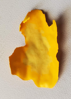
To same some time here's the red and red-coral mixes dried on the parchment paper for your review.

Red and red-coral mixes

You can see that there's three shades on here. Let me explain them.

Center right - True Red. I like this color. It's a vibrant red with not so great coverage. At least two coats are needed to get this one decent. More on that later.

Lower center - True Red and Coral in about a 3:1 ratio. I'm not exactly sure since I mixed and added until I liked it. This was the color stippled over the base coat.

Upper left - True Red and Coral in about a 4:1 ratio. Again I can't be certain because I mixed on the fly. This one is darker than the first mix because it went on after the glaze.

Not shown - The color from the upper left with more Coral to use as edge highlighting. It was probably about the same as the one in the lower center or slightly lighter.

As you can tell I'm not very concerned about matching these colors again. Orks are wonderful for variation. What I was concerned about was building up a depth of colors.

First up - base coating.

Orks with two coats of Bright Red as a base coat

Orks with two coats of Bright Red as a base coat

Nothing too fancy here, it's a red base coat. If I were doing fancy painting I would have gone back over all the areas I was going to paint red with white or grey so they were a consistent base. As it is there's black, grey, white, and some yellow under there. There are differences where those change but I didn't think it was important enough to spend the effort.

Base Stipple

Orks with red-coral mix stippled on base coat

Orks with red-coral mix stippled on base coat

As you can see there's a lot of difference between the two colors and it looks pretty harsh. This time I cut down a smaller brush for stippling since I was going to be painting smaller areas. I also did a few lines of the lighter color on the weapons where I wanted a different effect. I'm going to work on that later as I get more into the details.

Glaze

Wine glaze over the base coat and stipple

Wine glaze over the base coat and stipple

The wine glaze smoothed out those color transitions nicely and added the depth and lining. The red-coral mix is still more visible than the yellow mixes were but that's part of painting red when you're not doing it in lots of layer transitions.

I also moved the glaze around while it was wet so it would have some variation rather than making it smooth. It's kind of subtle but adds to the overall effect.

Second Stipple and Edge Highlights

Second stipple coat and edge highlights

Second stipple coat and edge highlights

And the bulk of the red is done. It's still got a kind of pink cast to it in my opinion but not enough to make me want to do anything about it. On the tabletop it isn't all that obvious and with all the other colors that will be involved it won't stand out like it does here.

I'm not going to say the red is done. I know I'll be using red in detailing so there will be more on the models. I don't know what I'm going to do about color, depth, etc. until I get to that point.

One thing that slows down the process now is picking where to paint a color. That happens at the base coat step. Orks are random. Random is more difficult than people think. We like patterns. Trying not to make patterns is frustrating because I keep double checking myself. In this case it's worse because of the prevalence of red in the canon color schemes. I did my best.

Going forward the posts won't be about a single color. I'm past that point in the process. The bulk of the models have been painted and now it's on to the detail work. The technique I use for important colors is well documented (base coat, stipple, glaze, stipple, edge highlight) so I'll do the same as here and just link back to the original post without showing all the stages of the process. Unless I think it looks cool in which case you get to see all the steps.

You will notice I haven't really touched the orks except when I overpainted a color. That's because I consider them a separate object to paint. It would have been very nice if the riders were separate models but they're not so I work with what I have. I did do some black base coats when I was in my black phase and those may or may not stay. It's all about what looks good in the moment really.

Friday, March 11, 2022

Ork Speed Freeks - A Work in Progress 4

And we're on to colors! Well. One color. Since these are going to be run mostly as Evil Sunz that means yellow is the main color for them. That's just how it is. And of course yellow is one of the more difficult colors to paint.

I started trying out miniature paints and found that even with the surplus of paints I have I didn't have the right yellow to get a color I wanted. Yes. I did look at mixing, as much as I don't like mixing paints for armies. I even ordered another set of yellows but I'll show you what happened there later. I ended up buying craft paints for a couple of reasons.

One - They're cheap. Vehicles take a lot more paint that miniatures for the most part and there's no real need to use the expensive stuff for them.

Two - They cover well. Once again I'm looking at army painting here. So covering well is an important thing.

The colors I decided on were these. They're the Hobby Lobby house brand so I included Pantone numbers for those who are looking for a close match. Since I have a Pantone sample swatch book I have to assume everyone has one.

  • Anita All Purpose Acrylic - 11164 Ripe Apricot - Pantone 150
  • Anita All Purpose Acrylic - 11005 Bright Yellow - Pantone 116 (close enough)
  • Ivory (any will do)
  • White (any will do)

Anita craft paints in Ripe Apricot and Bright Yellow

The first layer is 2 coats of Bright Yellow over grey primer. Or use white primer. But I don't recommend black primer once you get into the colors because it's a pain in the butt to get both coverage and bright colors. But you do you.

Miscellaneous Ork models with 2 coats of bright yellow paint

Miscellaneous Ork models with 2 coats of bright yellow paint

It looks a little bland but that's fine. It's a solid yellow base to use to build up (and down) colors. I left some areas unpainted that I plan on painting other colors and I painted some areas that will probably get painted other colors. It's an evolving process.

Now we get into the fun part of painting orks - the lack of uniformity. For most factions you want things to be uniform. Because, uniforms. The ork faction is pretty haphazard by design so it gives you a lot of creative freedom and the ability to cut as many corners as you want.

The next layer is a stipple of lighter yellow. Let's get into that.

For those who aren't familiar with the stipple technique. You need a brush with short, stiff bristles. Take one of your synthetic ones that isn't floppy and cut it straight across a short distance (1/8 inch or 5mm at minimum). This brush is gonna get wrecked but that's fine. Then pick up a small amount of paint, maybe double what you would use for dry brushing but half as much as you'd use for regular painting, then you're ready to stipple. Stab the area to be painted randomly with the brush. Voila - stippled. Or maybe gobbed in this case.

I mixed up a lighter shade of yellow from the base coat; I wanted something duller than the color straight white would give so I decided to use ivory too.

First I tried straight ivory paint and didn't like that the result was really dull and greenish.

Bright yellow mixed with ivory paint, on a swatch of bright yellow

See? Meh and greenish.

Next I tried a half-and-half mix of ivory and white. I wanted to dull the color (ivory) while still keeping it bright (white). That was the winner. Coincidentally it's almost identical to Reaper Miniature's limited edition Golden Glow paint.

Half and half ivory and white paint mixed in with bright yellow on a bright yellow swatch

Now that I had the lighter color I blotched stippled it all over the base coat. In reality I painted blotches over about half the base coat so I had both colors showing.

Bright yellow base coat with random lighter color areas

Bright yellow base coat with random lighter color areas

The orks sat here for a while due to some pretty serious real life issues. If you know me either you know what happened or you can ask. If you don't know me then just accept that they were pretty serious life issues. It took me a while to get back to painting in general.

On to the next step - covering up all that paint. Really what I did was paint over everything with a transparent glaze of the darker yellow. That blends the colors into a more harmonious whole while leaving me the ability to keep going light again. If that makes any sense. Just look at the pictures.

Dark yellow glaze

Dark yellow glaze

I used acrylic blending gel rather than matte medium because it has the glazing properties that matte medium doesn't. After mixing it with the paint I added flow improver until I was happy with the result. It's just like making the contrast paints in that I drew up the paint onto the side of the palette until it had the right viscosity. I'd try to explain more but it's something you have to learn in person. Remember - paint is cheap so keep trying.

You can see the previous colors through the glaze and that it pooled in the recesses to do some nice shading.

Next up was more paint! I'm using the light yellow mix again. I did the same stipple thing as before but in smaller areas.

Light yellow paint stippled over the orange glaze. Lighter yellow was used for edge highlights

Light yellow paint stippled over the orange glaze. Lighter yellow was used for edge highlights

These pictures are doing double duty because I took them after I used a lighter version of the light paint to do edge highlighting. To make it lighter I used white. That made it the bright color but it was already light enough that it didn't go cartoonish on me. I wasn't very picky about edge highlighting because orks. But I did do all the hard edges and the softer ones on those face fronts. I also did some on the big curve of the wartrike front fenders.

And that's it. The yellow is done. When I paint more the lighter yellows won't be exactly the same but they'll be close enough. You can see that this turned out a very good yellow without leaning into the orange too much and without being YELLOW. It is a difficult color to paint but I think I chose well when I picked the shades.

I got pretty sloppy when painting these. It's part of the way things go both when stippling and when glazing. Once I saw it was going to get messy I accepted it. That doesn't mean I didn't try to make it tidy. It meant that I knew I was going to have to do cleanup after it was done. As it is I'm going to hold off on that until the rest of the colors are painted or I'd be doing that more than is needed.

I did say I'd let you know know what happened with the set of yellow paints I ordered. I'm not going to name the brand. I like the brand. I use them when I paint miniatures. They didn't work for this particular project but that's nothing against them.

Discarded yellow first coat

This was one coat of the darker but not darkest yellow in the set. You can see that it already went green and just didn't look right. At least it didn't look right to me. It wasn't ork yellow. So I painted over it with the craft paint and never looked back.

This little end bit is to remind you to try things. Nothing was harmed here and it didn't take me much time to try, decide, and move forward. Some won't work, some will work, some will surprise you. If you're really not sure try one decent size area or a failed print/piece of sprue and use that as your test piece.